These uncertain times
Like everyone else, my life has been completely turned upside down by the COVID-19 pandemic. I’m a numbers person so I religiously check the number of cases, deaths, hospitalizations, etc. Whatever I can find! I find data comforting during these uncertain times.
My home state of New York was hit very hard by the pandemic in March and April. I found the New York State Department of Health COVID-19 Tracker which is very useful but I wanted to get the raw data myself. So that’s what I did. (It’s here if you want it too.) Now it’s time to check it out with R.
Getting COVID data in R
I’ll need these packages for formatting and plotting the data.
library(readr)
library(dplyr)
library(ggplot2)
library(lubridate)
library(janitor)
library(ggthemes)
library(zoo)
New York’s COVID data is pretty clear. There’s an API but it doesn’t go back as far as the csv file you can download, so I just do that every day and put it on gitub. You can use it too if you want.
newyork <- read_csv("https://raw.githubusercontent.com/katiesegreti/health/master/newyork_covid.csv")
names(newyork) <- make_clean_names(names(newyork))
newyork <- newyork %>%
  mutate(test_date = mdy(test_date),
         county = as.factor(county)
  )
I just did some mild formatting to make it easier to work with. I made the county a factor and ensured the date column is actually dates and not characters. As I would later find out, every state formats and presents their data differently, so these steps will be different for every state.
Make some New York charts
Now let’s make some charts, but first we’ll make a theme so the charts look nice.
bg_color = "gray95"
counties_theme <- theme_wsj() +
  theme(
    panel.background = element_rect(fill = bg_color),
    plot.background = element_rect(fill = bg_color),
    strip.background = element_rect(fill = bg_color),
    legend.position = "none",
    axis.line.x.bottom = element_blank(),
    axis.ticks.x.bottom = element_blank(),
    panel.grid.major.y = element_line( colour = "darkgray"),
    plot.subtitle = element_text(size = 18),
    plot.title = element_text(size = 22),
    plot.caption = element_text(size = 12)
  )
Now a chart for the whole state:
newyork %>%
ggplot(aes(x = test_date, y = new_positives)) +
geom_col(fill = "magenta", width = 0.8) +
counties_theme +
labs(
x = "",
y = "",
title = "Positive COVID-19 Tests By Day",
subtitle = "New York State",
caption = "data-chips.com"
)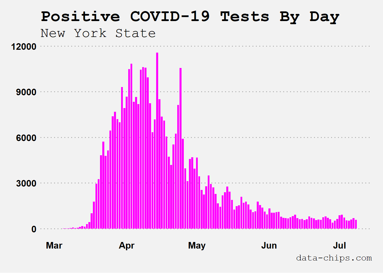 Yikes, those numbers from April are traumatizing! Good to see some progress being made as we get into the summer, but we definitely still have a long way to go as I’m writing this.
Alright, now let’s look at just one county. New York has 62 counties. The most populated one is Kings County, which is better known as Brooklyn. Let’s look there, and add a seven day moving average.
newyork %>% filter(county == "Kings") %>%
ggplot(aes(x = test_date, y = new_positives)) +
geom_col(fill = "magenta", width = 0.8) +
geom_line(aes(y = rollmean(new_positives, 7, fill = NA)), color = "midnightblue", size = 1.3) +
counties_theme +
labs(
x = "",
y = "",
title = "Positive COVID-19 Tests By Day",
subtitle = "Brooklyn, NY",
caption = "data-chips.com"
)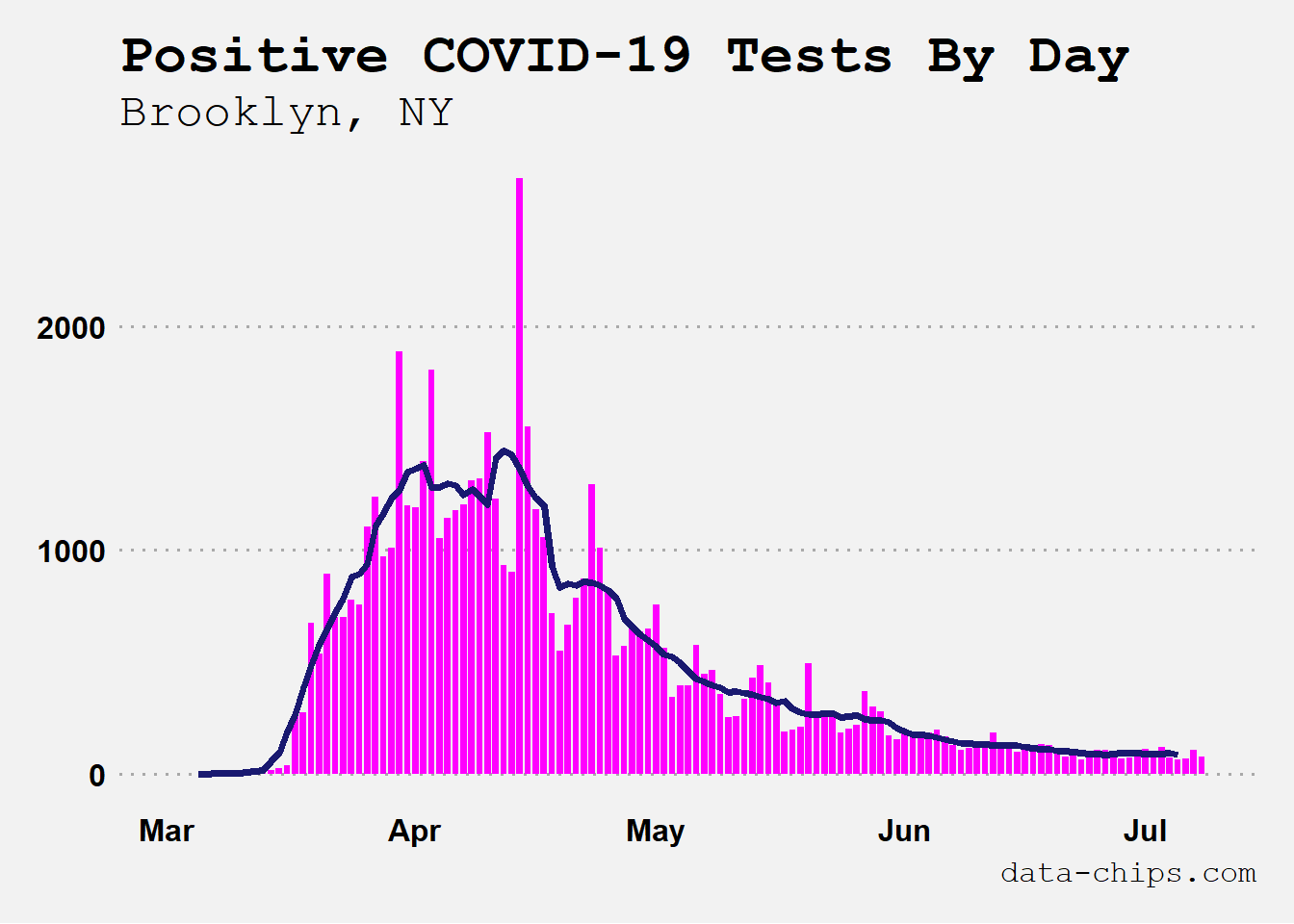 I check many counties every day, looking for any upticks so I can yell at people I know who live there to stay safe!
Make a dashboard? Sure!
Using shiny I made a dashboard mostly for my own nervous purposes, but I shared it with family and friends who might also find it useful. It focuses on county-level data. Once I got New York I added a few other states and I’m now up to six. Unfortunately New Jersey is not one of them, but it will be if I ever get my hands on their county-level time series data. I do have Connecticut though, so at least we have the majority of the NYC tri-state area!
You can access it here. I work on it when I have time, which is not as often as I’d like. I have a long wishlist of features I want to include, but I’ll keep that to myself for now in case I don’t get around to it. ;)
Other useful sources of COVID data
Mine is a work in progress, so if you’re looking for really comprehensive COVID data I recommend the following platforms. I check them every day:
The Washington Post has a national dashboard that shows the number of cases and deaths for the whole US as well as every individual state. You do not need a Washington Post subscription to use it.
The COVID Tracking Project collects data on testing, deaths, hospitalizations, etc. from every state and issues a daily report on twitter once all the numbers are in, focusing on specific regions and states. I highly recommend following them on twitter.
Also, if I have not included your state (yet), don’t worry. Just about every state’s official website has a dashboard or at least a report you can access.